Turbo Pudding
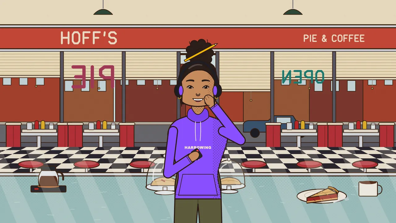
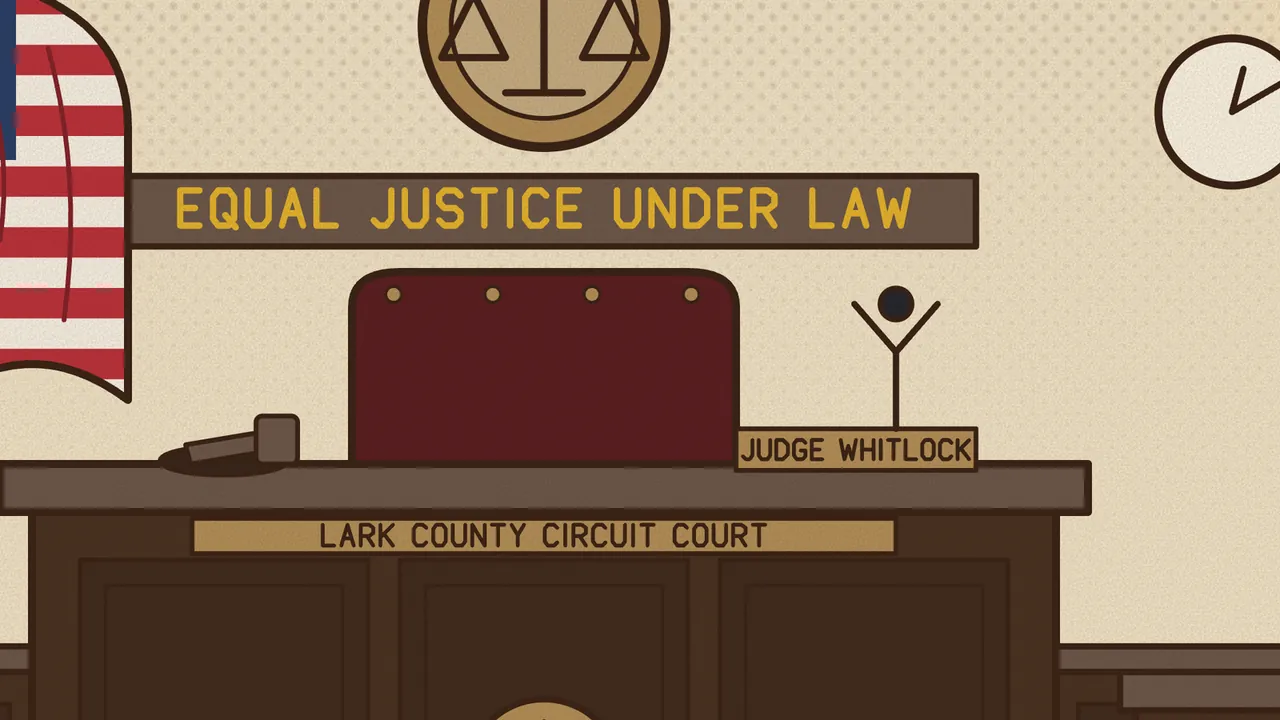
Twelve Neighbors takes place in Harrow, a little county seat in the fall, where the diner knows your order and you know half the people in the courtroom. You are Juror Seven in an arson trial. A story like that only works if the town feels like a real place, so every background in the game shares one look. Inside the project it has a name: Poster Americana.
Every picture in Harrow is drawn by the game itself in code, as flat shapes in a 1920 by 1080 frame. Here is how that look is put together, and why we made each choice.
A warm outline, never black
Everything in Harrow sits under one thick outline, five pixels wide at full HD. It is a warm, dark brown, never pure black. Black lines can make a picture feel cold, like a diagram. Brown reads more like ink on old paper.
Inside the outline, the shapes are flat, and the town has its own short list of colors: rust, mustard, barn red, pine, cream and denim, plus a neon pink and a teal. A maple is a trunk and a crown of overlapping circles in rust and mustard, and where the light hits, each circle gets a lighter cap of its own color, not a spot of another one.
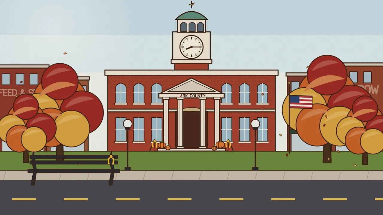
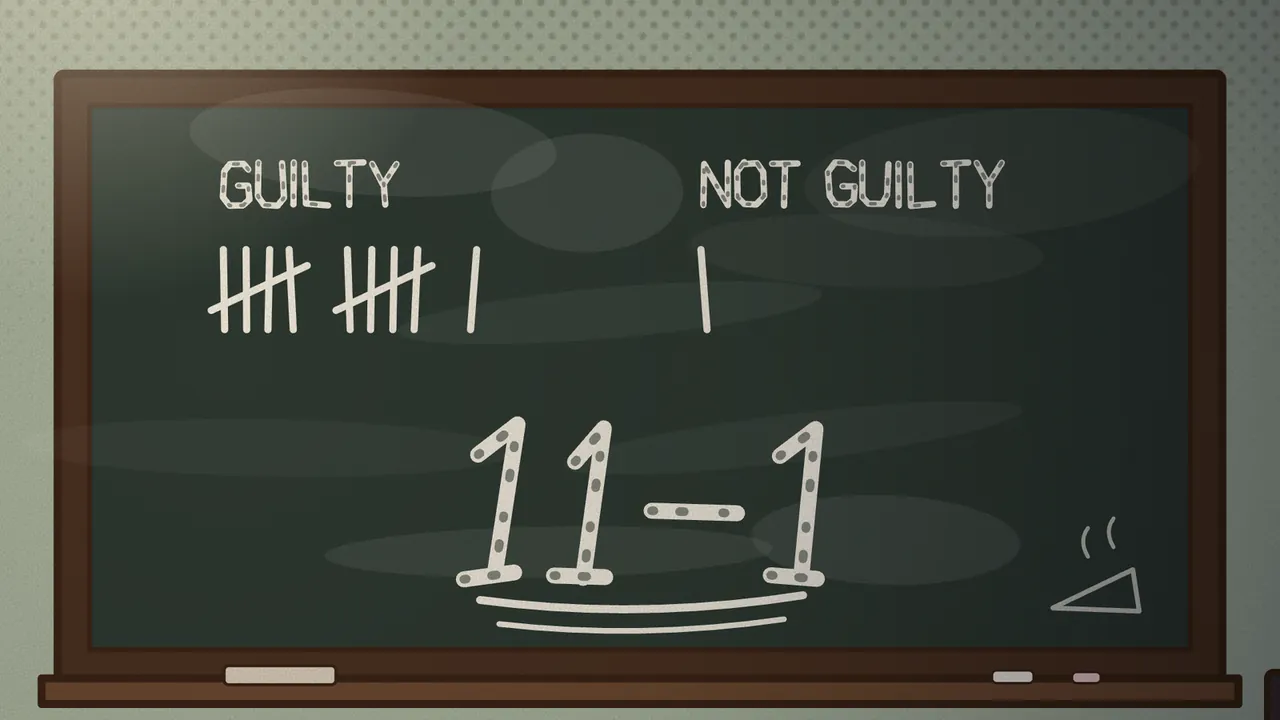
Small rules like these are written right into the backgrounds. The flag on the square stays small and off to one side, because it is scenery, never the subject. On a phone, the game shows an upright slice of each wide picture, and every background knows what that slice has to keep: the clock face on the square, the last vote on the chalkboard in the jury room.
Dots instead of gradients
Smooth color gradients would make Harrow look like a screen. We wanted it to look printed. So wherever a wall darkens toward the ceiling or a shadow falls under a vent, the shade is made of dots, the way old posters and comic pages were printed: big dots where the shade is strong, smaller ones where it thins out, all on a grid turned 45 degrees.
Over the finished picture goes one more layer, a fine paper grain. It is a small square of noise, 240 pixels across, repeated over the whole frame, so it costs almost nothing to draw.
Light is not ink
There is exactly one exception to the no-gradients rule, and the code puts it plainly: light is not ink. A lamp, a lit window or a glowing sign gets a real soft glow.
Night works the same way in reverse. Instead of a gray haze over the picture, the dark is laid over the whole frame with holes left open wherever a lamp still burns. The light is simply where the dark is not.
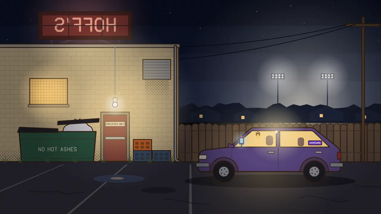
That one is from chapter 2, and it’s a favorite of ours. Almost the whole frame is dark, so your eye goes straight to the few lit things.
Words made of lines
Harrow is full of writing: shop signs, a dumpster that says NO HOT ASHES, the plaque over the judge, chalk in the jury room. None of it uses a font. Every word painted in the town is drawn as strokes on a small grid, six units wide and ten tall, letter by letter.
The reason is practical. A line from the game can become a quote card to share, with its scene behind it, and inside an image like that, web fonts never load. A sign set in a font would come out in a plain default typeface. Letters made of lines look the same everywhere.
The same letters can shake a little for a hand-painted sign or lean for italics. For chalk, each stroke is drawn twice: once in white, then broken up by the dark of the board showing through.
The same town every time
Where a picture needs a little randomness, like falling leaves or stars, it uses a fixed seed. The same scene comes out exactly the same on every device and every time you come back.
Some of that randomness is there to make the town feel lived in. The jury room has twelve chairs that never match, because the county bought them one at a time, and a thirteenth folded against the wall for the alternate.
Take a seat
Chapters 1 and 2 are free to play in your browser at twelveneighbors.com. The full game, all seven chapters, is $9.99, paid once. More about the game is on the Twelve Neighbors page.